Bowan Island is one of Australia’s original artisan bakeries. Founded in 1989, they’ve received vast acclaim across the country for their sourdough loaves, crafted with an 85-year-old starter. In 2023 they set their sights on taking their products international.
Creative Team
Max Johnson - Design, Art Direction
Matt John - Creative Direction
Made at Anatomy Studios, 2023
Max Johnson - Design, Art Direction
Matt John - Creative Direction
Made at Anatomy Studios, 2023
The Approach
Our thinking behind this identity was to combine visual cues of both the past and the present. This decision was informed by Bowan’s brand pillars of innovation and heritage, which were both visually represented through a unique blend of contrasting typography and colour.


Colour
Bowan’s brand palette took inspiration from the ancient method of breadmaking, with each colour representing a vital component in the baking process.

Typography
To best align with our ethos for the brand identity, we chose to use a pair of strongly contrasting typefaces that could work together harmoniously as headliners.
Dinamo’s ultra-modern sans serif Favorit, alongside Mark Simonson’s elegantly nostalgic Bookmania, made for the perfect pairing to do so.
Dinamo’s ultra-modern sans serif Favorit, alongside Mark Simonson’s elegantly nostalgic Bookmania, made for the perfect pairing to do so.

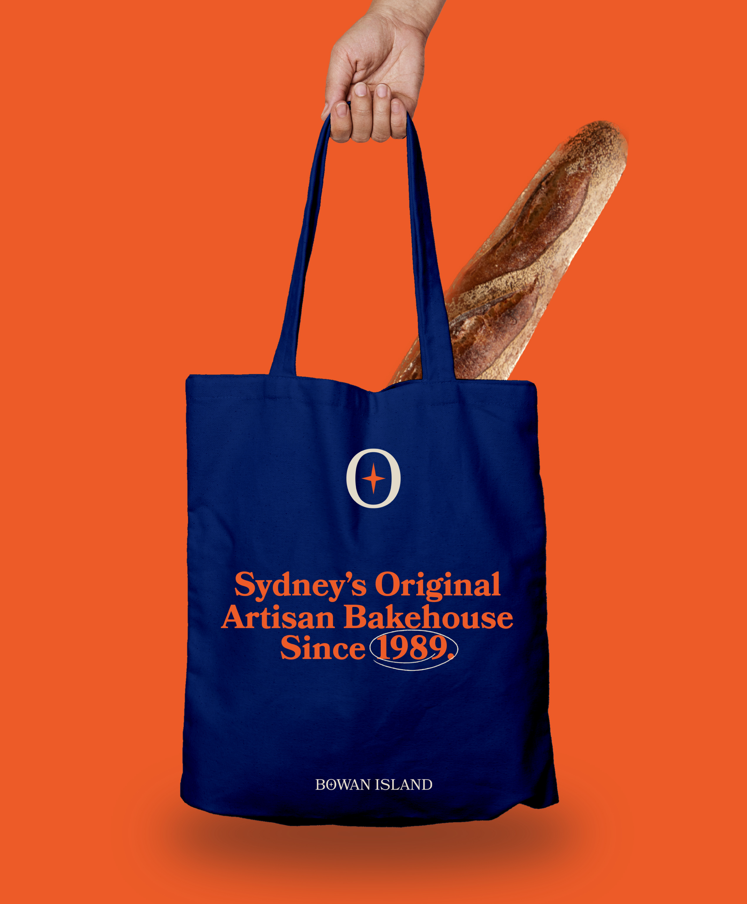
Brandmark
The Bowan Island brandmark pays subtle homage to the brands original logo which contained a compass. The simplified shape in the middle is representative of the compass needle.
The brandmark acts as a visual double entendre, with the negative space forming a bread loaf that has been scored.
The brandmark acts as a visual double entendre, with the negative space forming a bread loaf that has been scored.