Kings Domain have cemented themselves as a Melbourne institution, with six barbershop locations and an academy, they’ve become well known for their luxurious services. We worked alongside them to help establish a more refined and cohesive visual identity.
Creative Team
Max Johnson - UI/UX Design, Graphic Design, Art Direction
Matt John - Creative Direction, Branding
Photography - Kings Domain
Made at Anatomy Studios, 2023
Max Johnson - UI/UX Design, Graphic Design, Art Direction
Matt John - Creative Direction, Branding
Photography - Kings Domain
Made at Anatomy Studios, 2023
Website Design
Kings’ came to us in need of a website that was both as timeless and as stylish as the cuts they produce.
The entirety of the site was created as a working prototype in Figma, which allowed us to take the team on an interactive journey from start to finish.
Our intention was to create a user interface that was not just visually striking, but also informative and intuitive for users. Check out the site here.


Brand Refresh
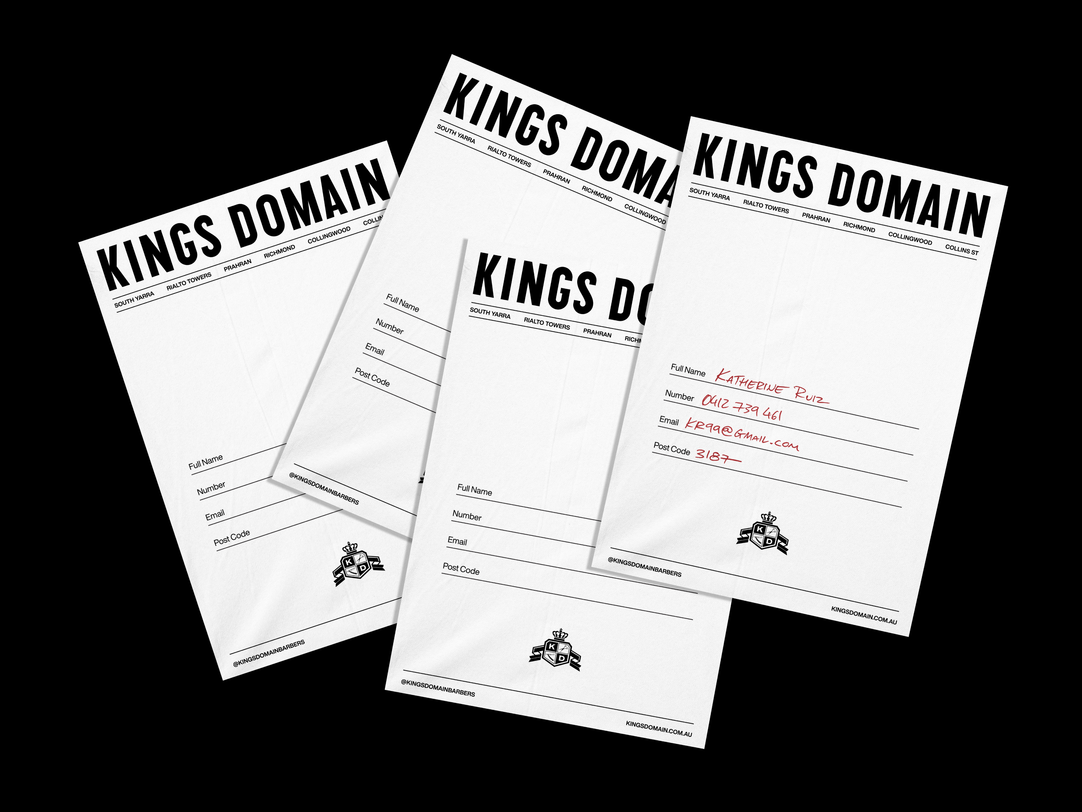
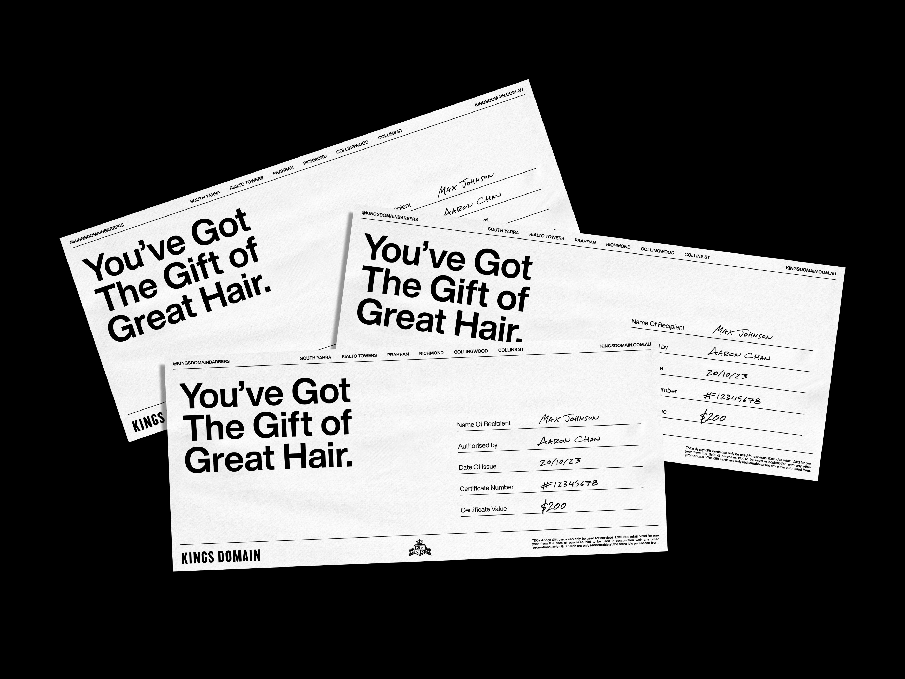
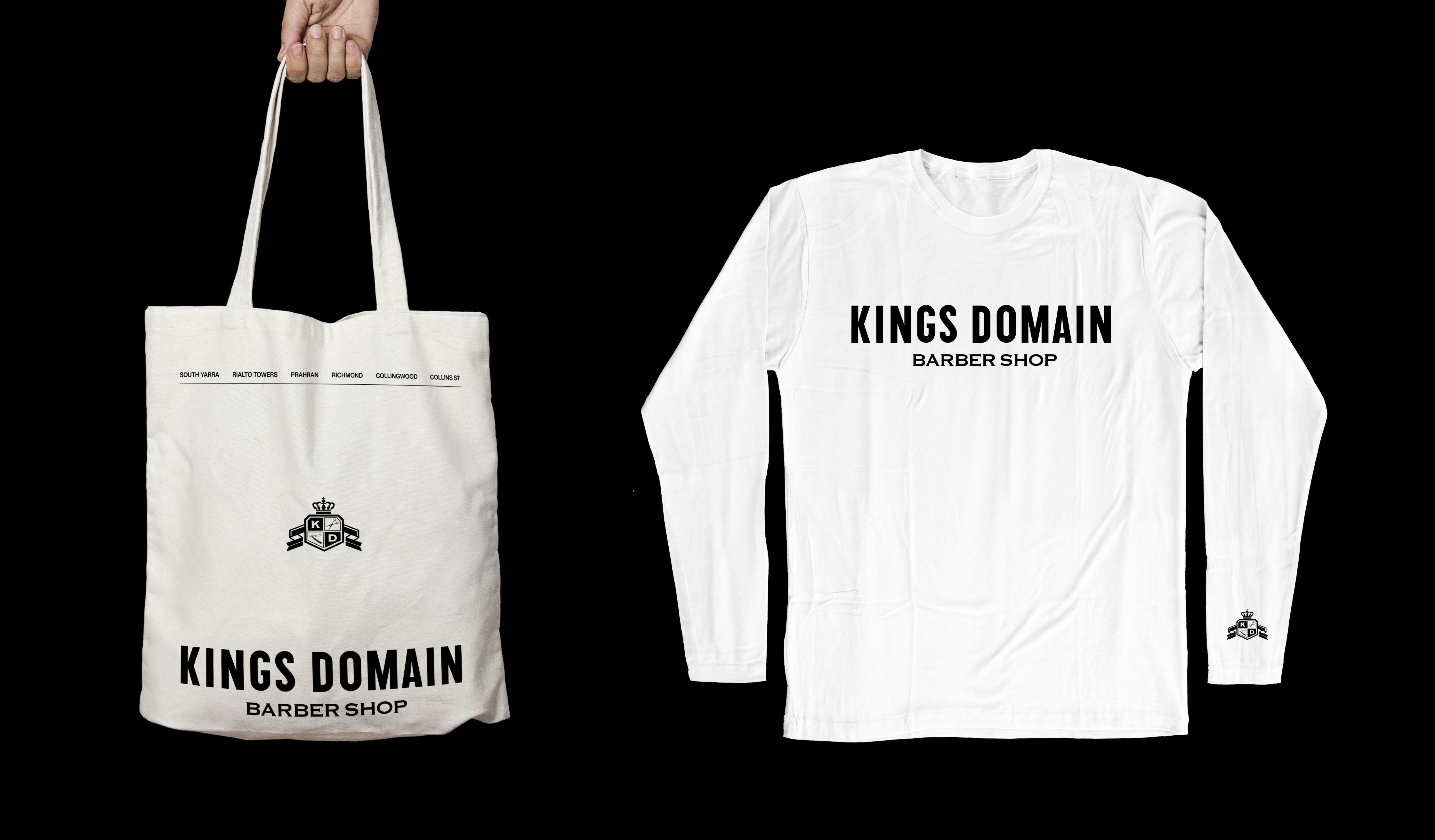
After 10 years of operating, Kings Domain found that their brand identity had become clouded and mismatched, with a clear lack of cohesion across visual collateral and in-store fit outs.
We sought to rectify this problem, starting with a rigorous brand audit. This helped us to identify the areas of opportunity and align on where the stakeholders wanted to take the brand.
The results were an ultra clean, achromatic identity that repurposed the original King’s branding assets in a way that felt brand new.